Josh Ferdico
Josh Ferdico is an Omaha, Nebraska based photographer. He photographs candid, merchandise, and portraits. He currently specializes in sports photography. This branding was created to replace a logo that was outdated and didn’t have any branding to support it.
LOGO
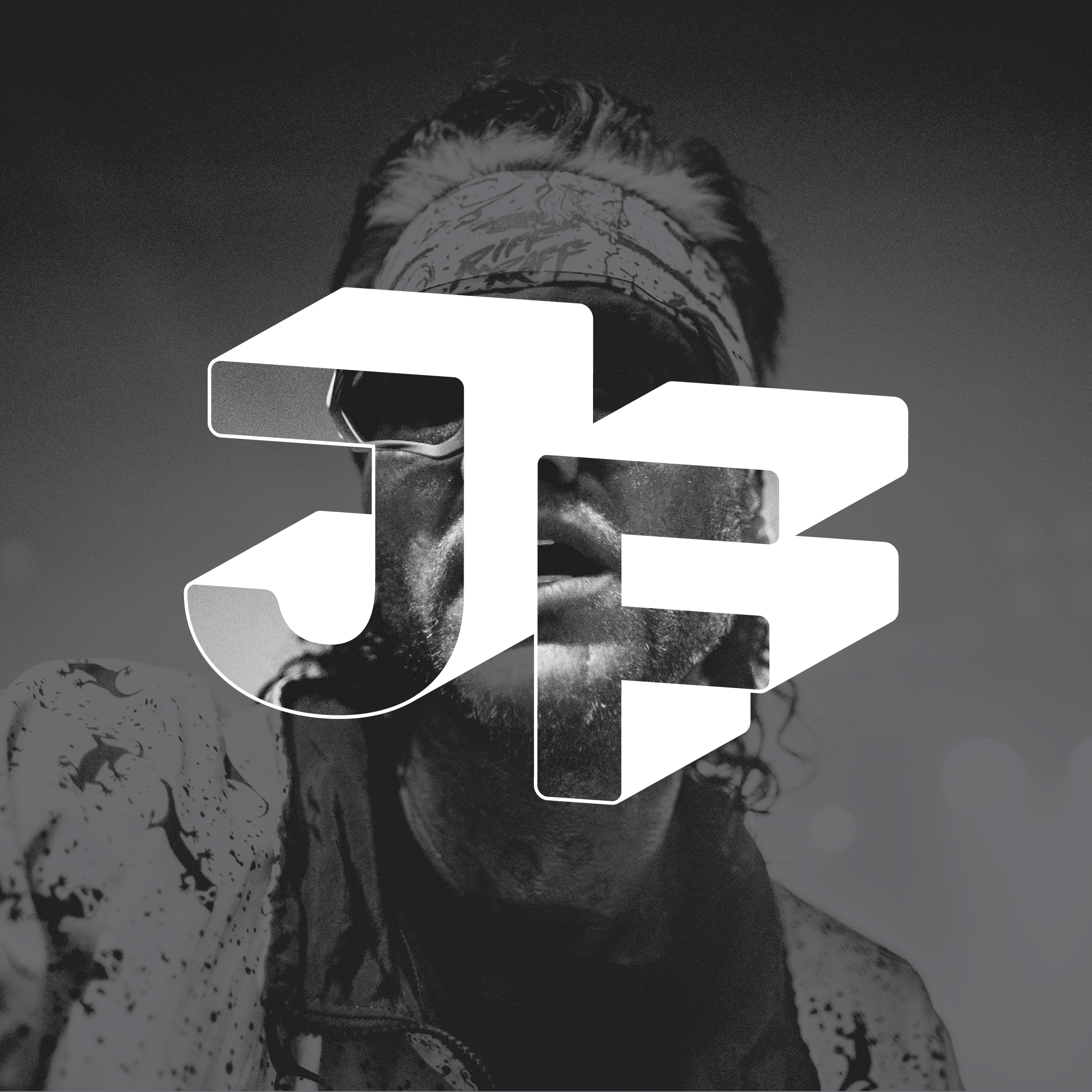
From the beginning, Josh wanted a logo mark that showed what he does for a profession without completely spelling it out. One word that created inspiration through this logo is perspective. Photographers create a perspective in their work that forces the viewer to perceive the environment a certain way. This logo consists of Josh’s initials with perspective on it. The inside of the logo is transparent so you are able to not only see his mark, but his work through it.
COLOR PALETTE
A black and white color scheme was chosen to let Josh’s photography do all the talking. This allows every color to be seen in its true form without having to compete. Along with the black and white scheme, the mark can be varied to 80% opacity to further not distract from the photographs.
TYPEFACE
The typeface chosen to represent the brand is Rubik. This font was chosen because it does not over power the logo when used underneath and comes in a variety of weights.
BUSINESS CARD
Josh is anything but average. He is an exceptional photographer and stands out from the rest of the profession. I have designed his business cards to reflect that uniqueness he holds. The square shape of the card makes them stand out from any stack.
MARK ON WORK
EVENT PHOTOGRAPHY
MERCHANDISE PHOTOGRAPHY
SPORTS PHOTOGRAPHY
CANDID PHOTOGRAPHY


